

UX Case Study
Enhancing Accessibility: A UX/UI Evaluation of Skånetrafiken’s
On-Board Information Screens
February 2025 - Personal Project
Project Context
I took a closer look at how Skånetrafiken’s on-board bus screens in Malmö could be made more accessible.
Project Details
Type
Article
Role
Product Designer
Project Tags
Skånetrafiken, Transportation, Color Blindness
Project Source
You can read this article on Medium
- Introduction: Why This Matters
Like many Malmö residents, I rely on public transportation for daily commuting. Skånetrafiken provides a well-structured app that delivers all the essential travel details — bus routes, schedules, transfers, and walking distances — in a clear and user-friendly way.
Inside the buses, digital screens display real-time stop information, including the current location, upcoming stops, and estimated time of arrival. At first glance, the design seems functional and well-structured. However, as a designer, one question immediately came to my mind:
Are these screens accessible and user-friendly for everyone?
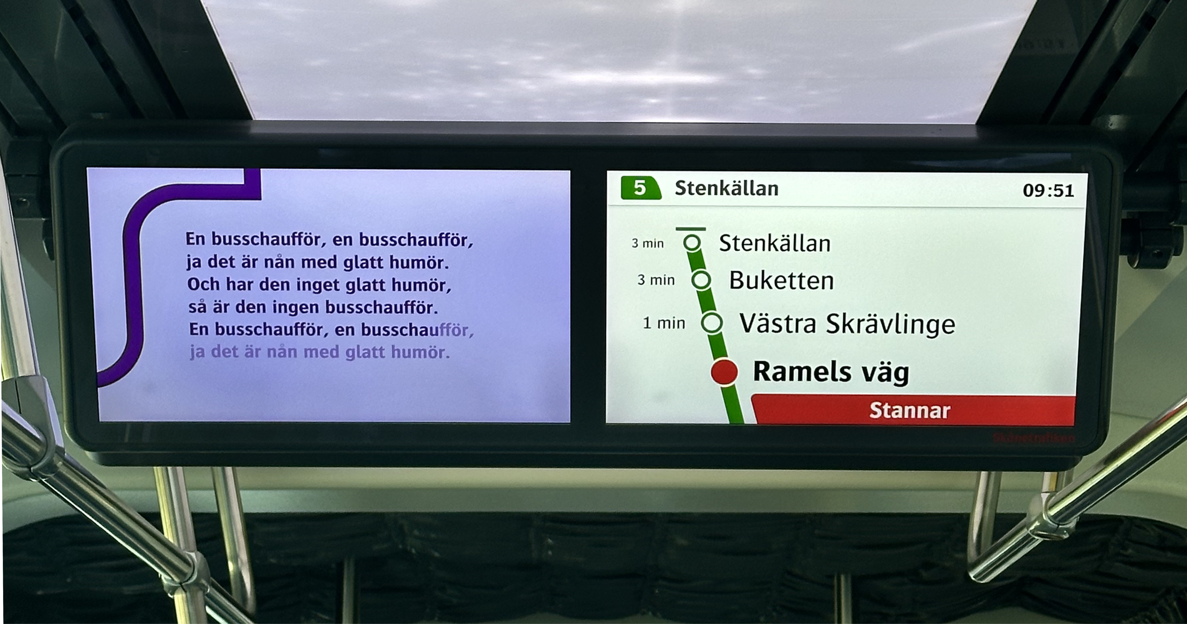
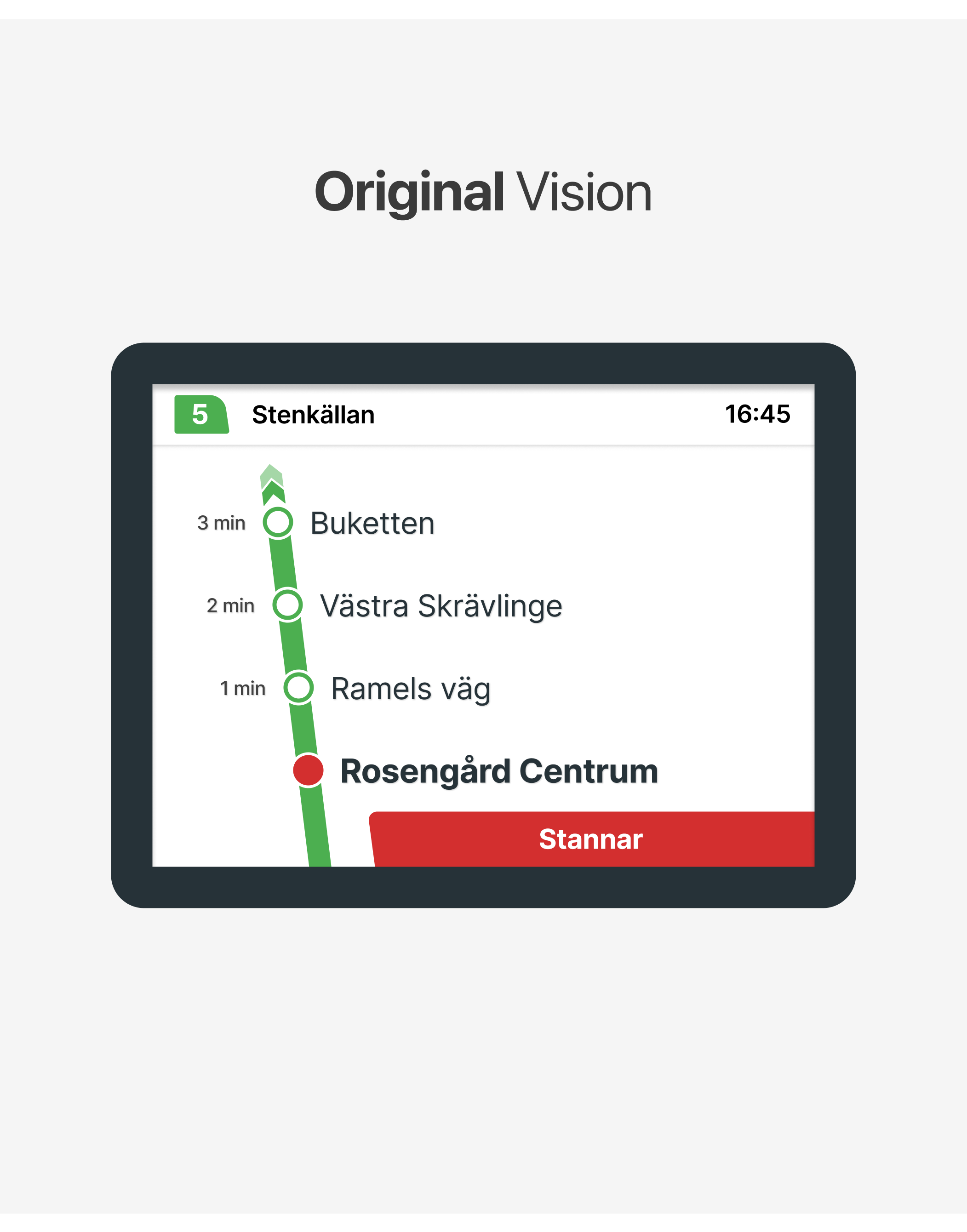
In the bus screen shown in the photo, green is used to represent the route. As the bus approaches a stop, red elements appear: the stop’s empty circle turns red, and a box with the text “Stannar”(Stopping) is displayed.
This means that red and green — two colors that are particularly challenging for colorblind users — are frequently used together.
While the interface works well for me, I began to wonder if it was equally accessible for everyone. This curiosity led me to evaluate the screen design from a UX perspective and explore ways to enhance its accessibility.
Given the high rate of public transport use in Sweden, these statistics highlight the importance of considering color blindness and other visual impairments in design.
By addressing these challenges, we can create a more inclusive experience that ensures vital travel information is clear and accessible to all passengers with small changes.
- Current Design: Key Issues
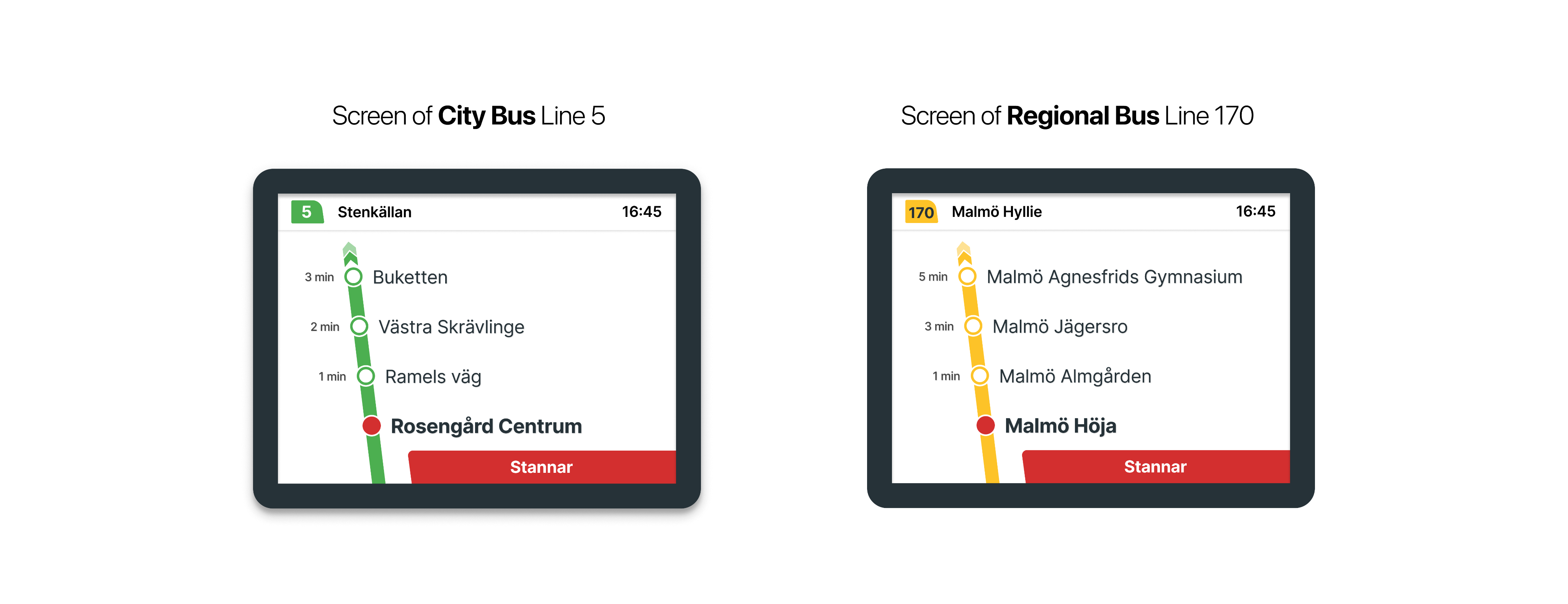
According to information from Skånetrafiken, Malmö’s bus routes are divided into two categories:
City Bus and Regional Bus. In the on-board bus information screen designs for these routes, the path illustration adopts the color of the respective line. However, this creates some confusion. By conducting a general evaluation, we can identify the key issues.

From color psychology perspective, using green and yellow to represent an ongoing route may be misleading, as green typically signifies success or completion, while yellow suggests caution or a temporary state.
The green-red combination can be difficult to distinguish for users with color blindness, while the yellow-red pairing is problematic due to their similar hue and meaning.
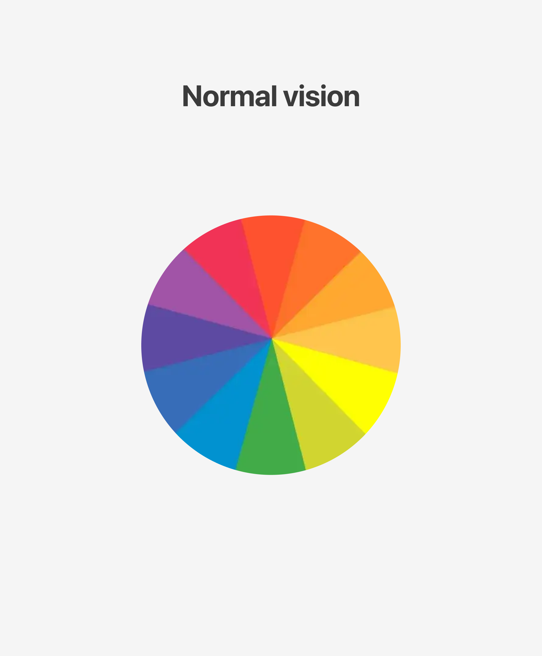
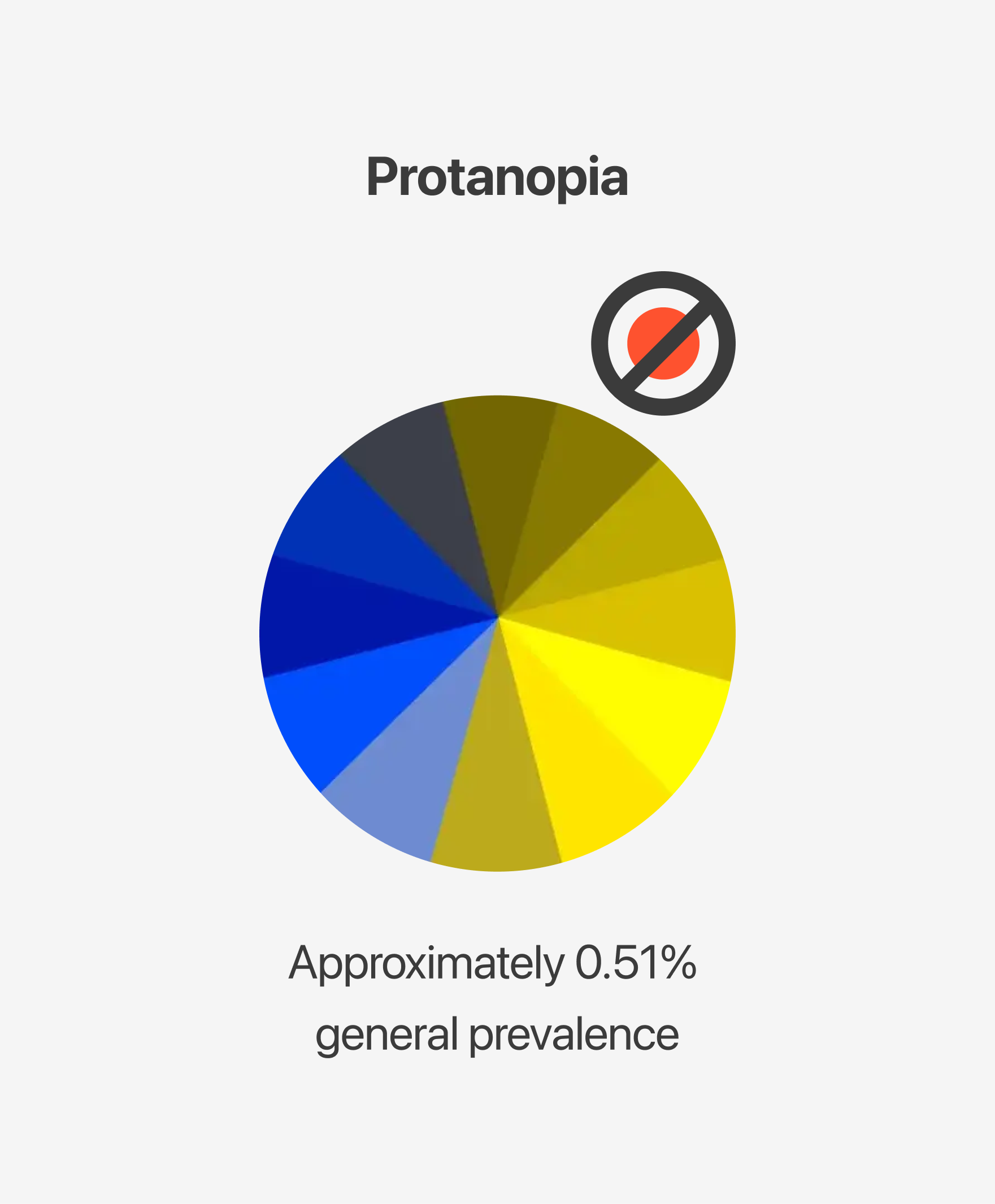

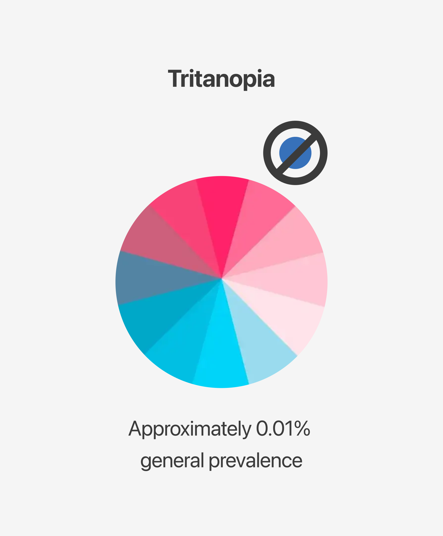
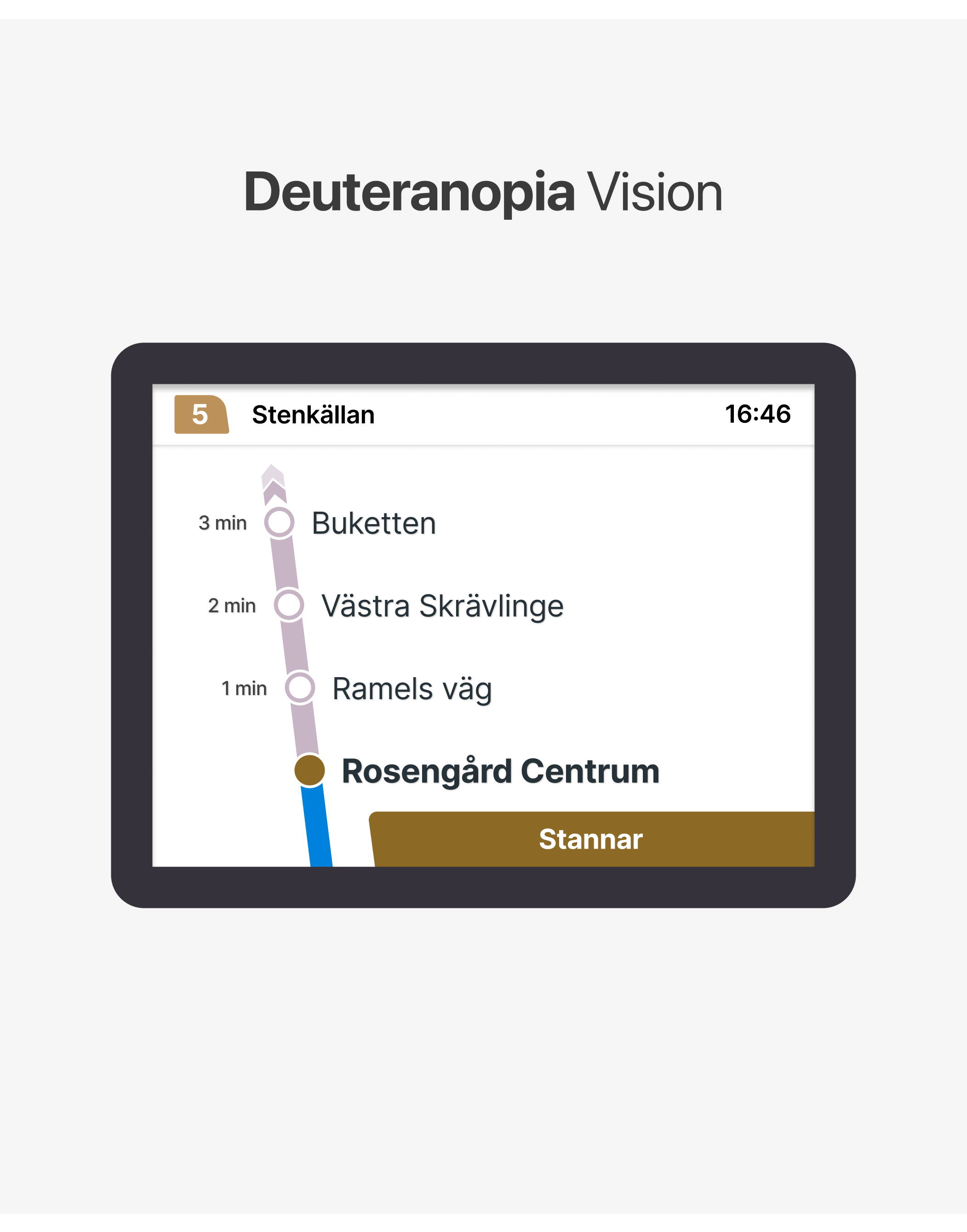
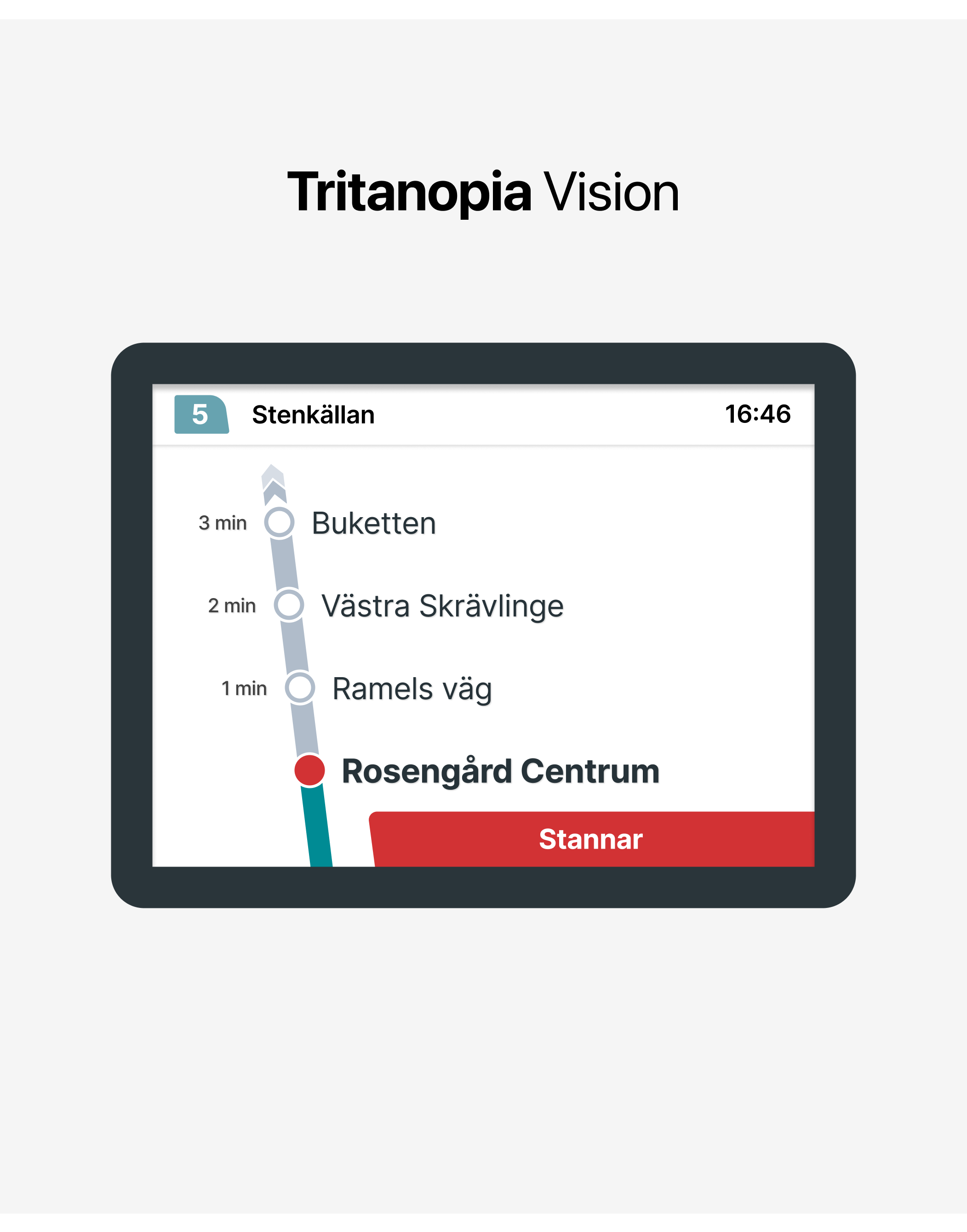
Deuteranopia (Green Blindness), Protanopia (Red Blindness), and Tritanopia (Blue-Yellow Blindness) are the most common types of color blindness. By evaluating these conditions, we can gain insight into how users perceive the screens.
While conducting this evaluation, I used Figma Color Blind plugin. I also tested the accuracy of these findings using color blindness tools such as Colblindor and CVSimulator.
Here are the results:
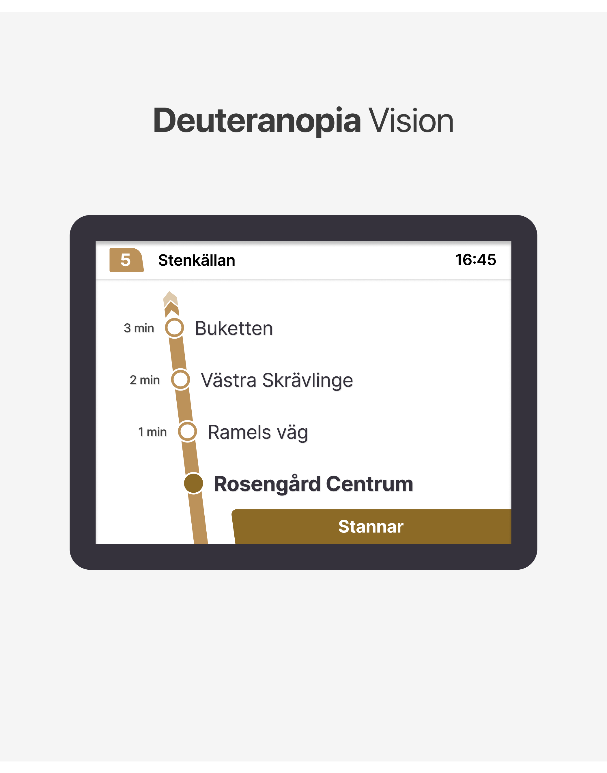
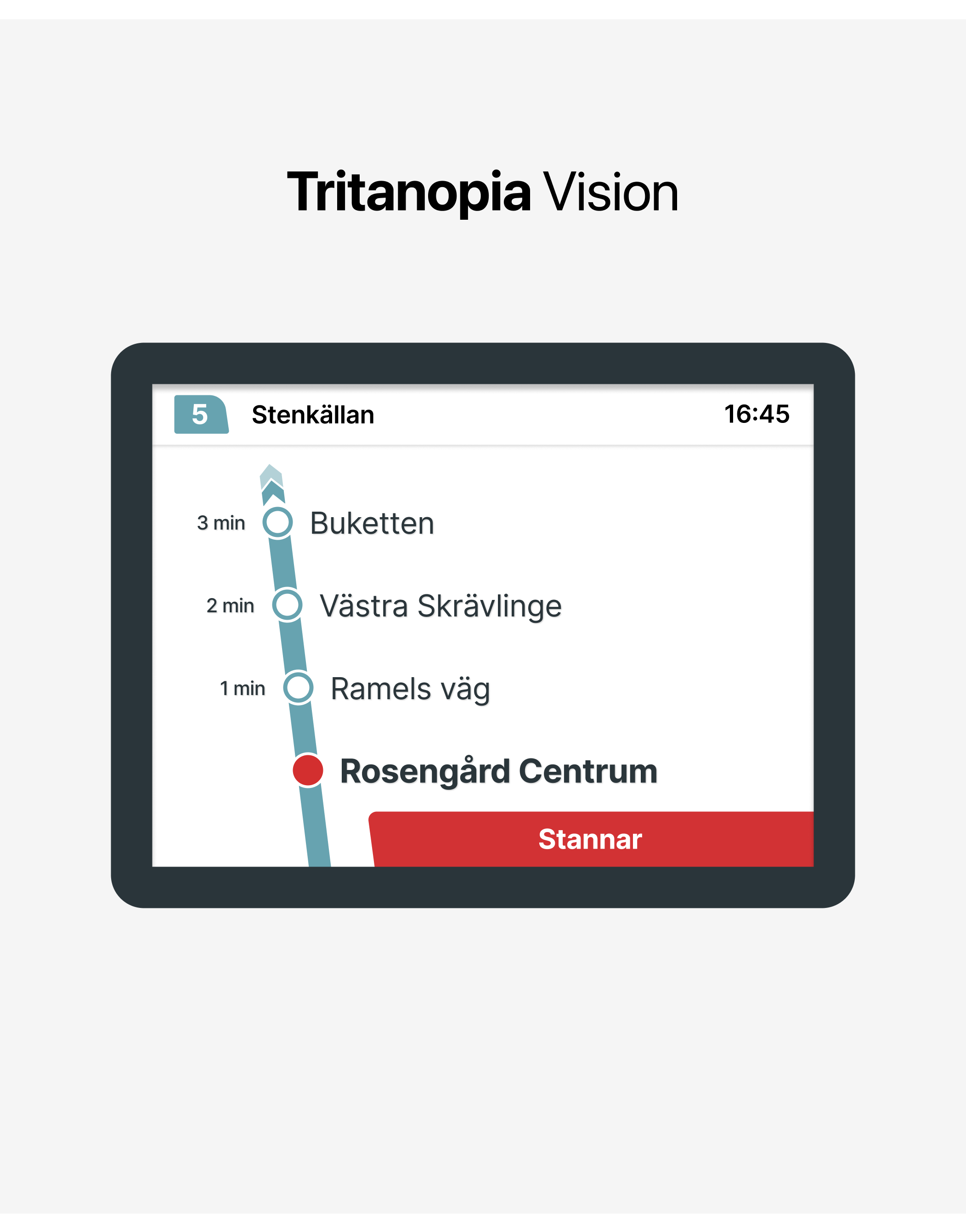
As clearly seen in the vision of the different types of color blindness, the colors on the screens become very similar to each other, resulting in a decrease in clarity.
- Improvements: A More Accessible Aproach
How can we make the screens better?
Resolving this color confusion is actually quite simple. With minor adjustments, we can make the screen more
user-friendly and accessible. It’s important that the changes are minimal because this screen is used by many people. Designing a screen that is too different from the original might confuse the current users and take time for them to adapt. Therefore, my primary goal is to improve the experience with small adjustments.
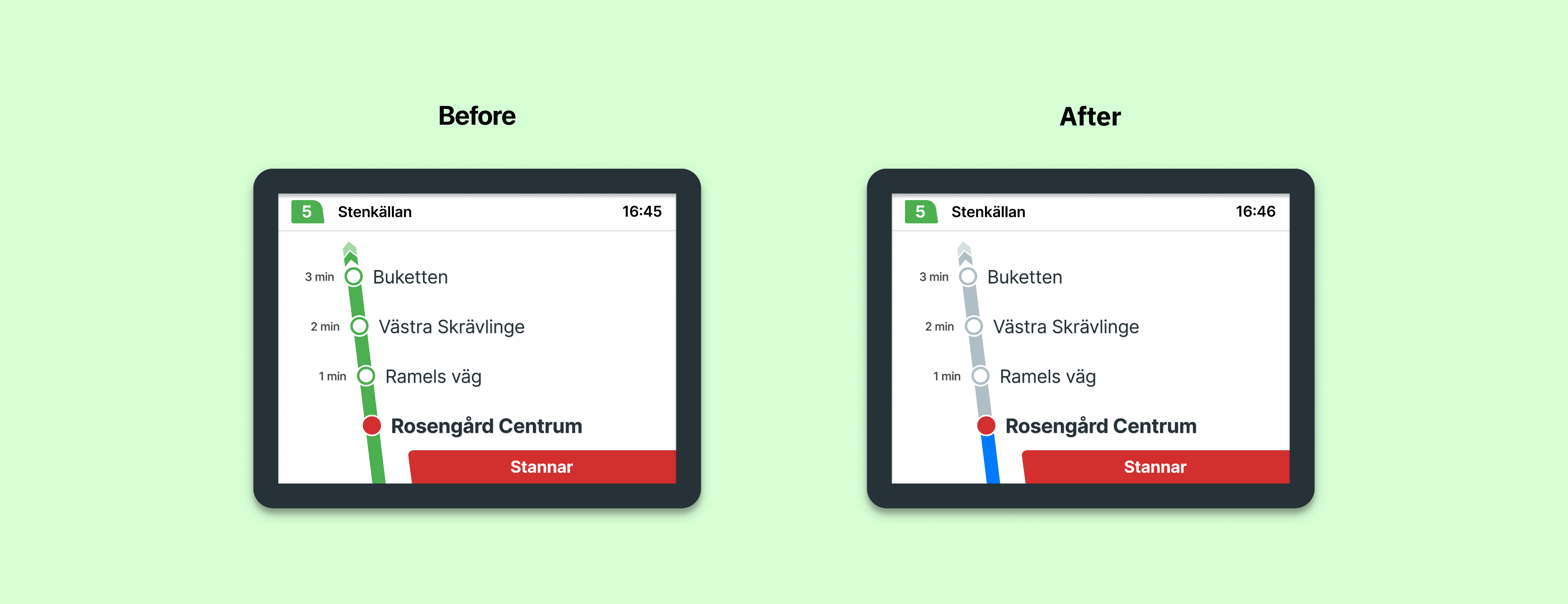
3.1. Choosing the right colors

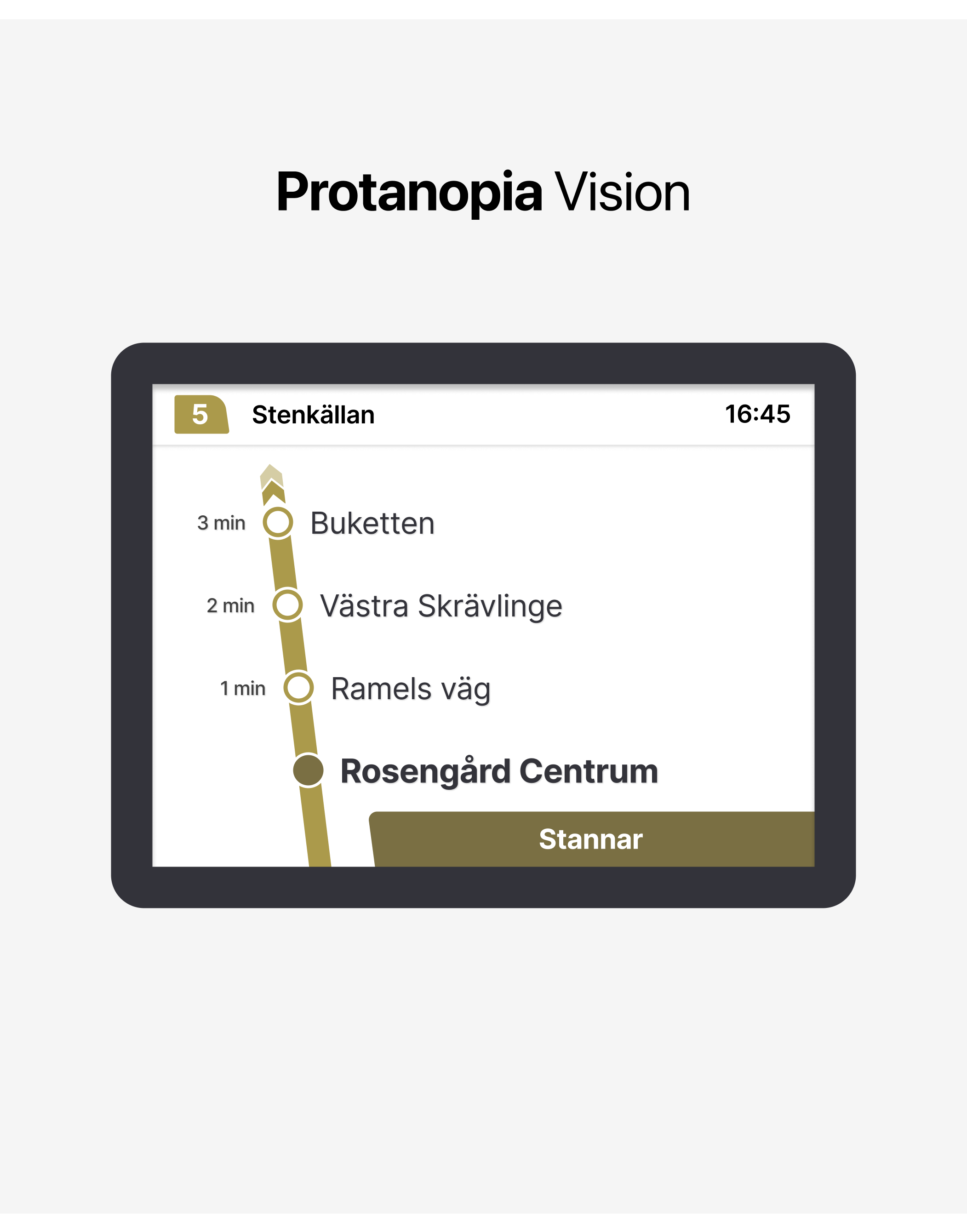
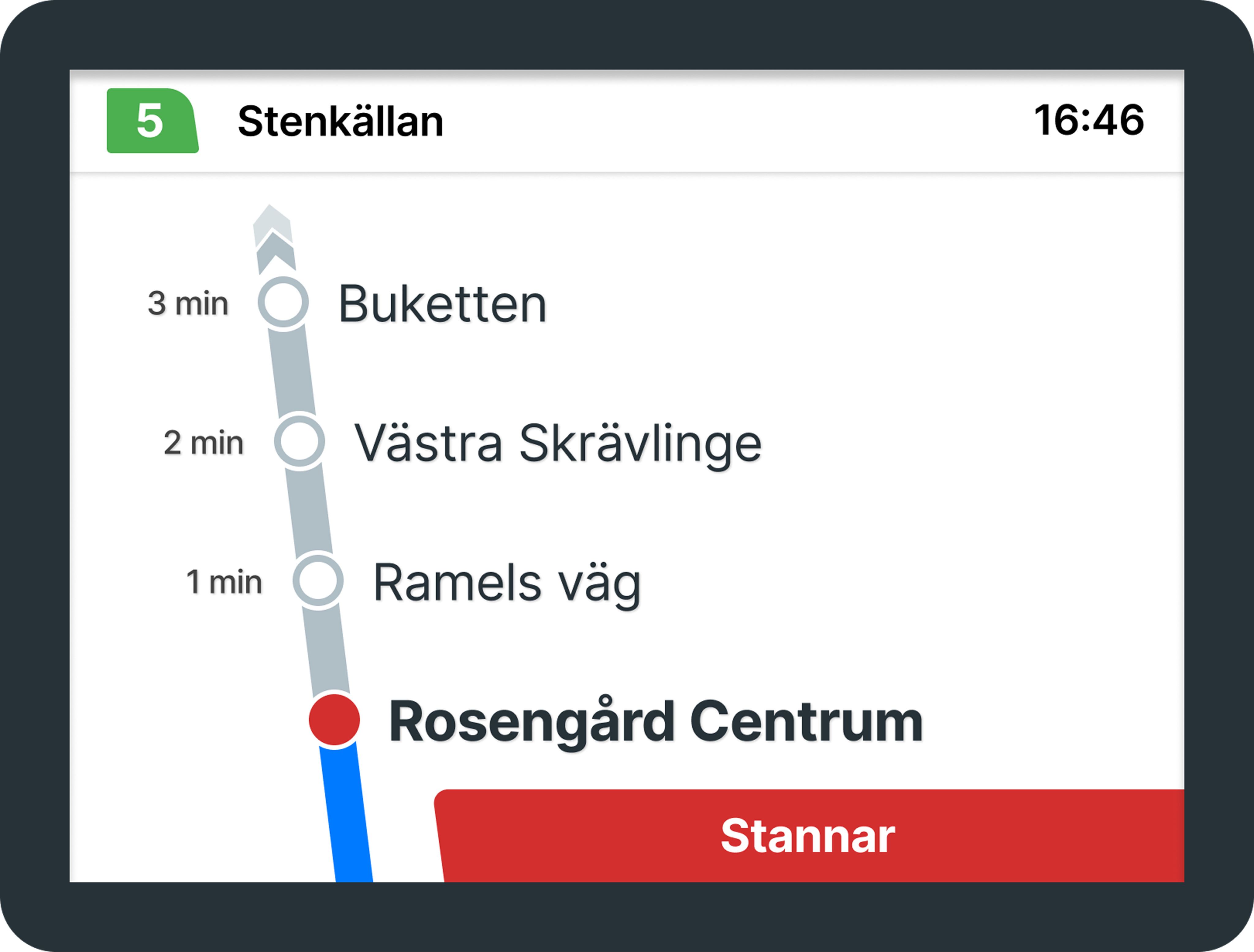
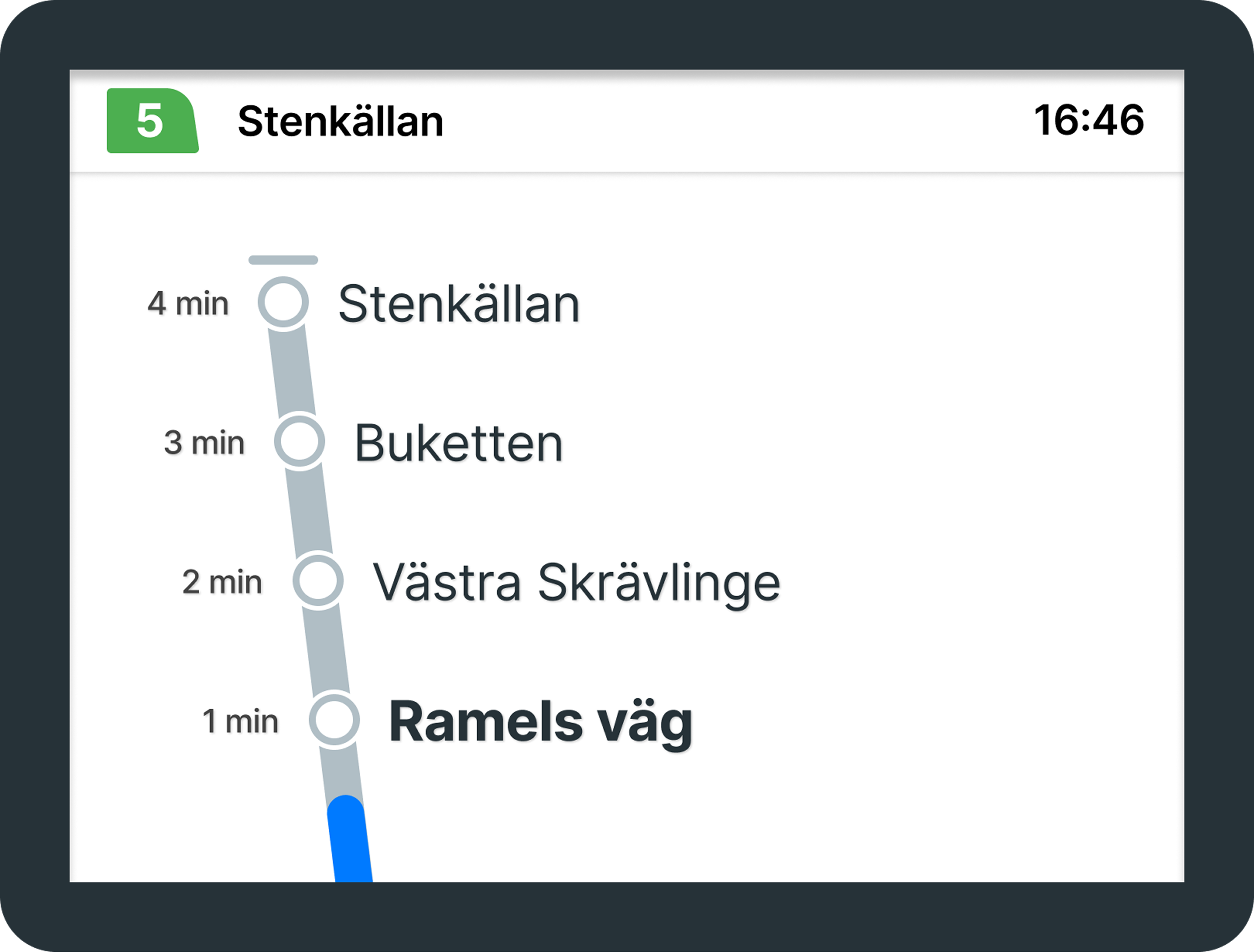
Blue and gray are generally considered safe colors for different types of color blindness. While they are not universally accessible in all cases, they can be quite effective when paired with the right design elements to provide a clear distinction.
That’s why I chose gray to represent the route and blue to indicate the progress. By visually distinguishing between completed and upcoming routes, users can more easily interpret the information displayed on the screen. These colors can be used for both the City Bus and Regional Bus routes.
We can also conduct a color blindness analysis on these newly selected colors and observe the results.
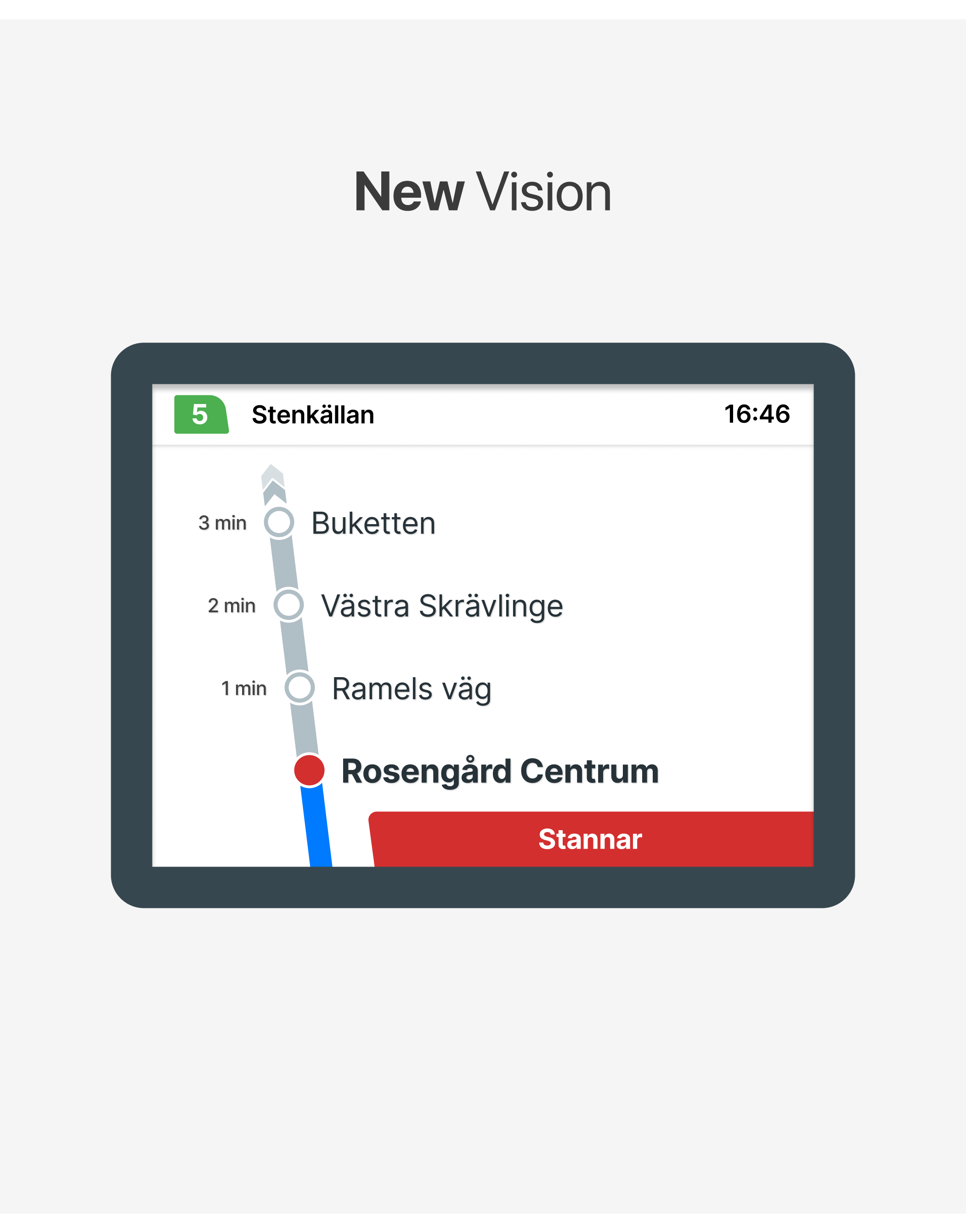
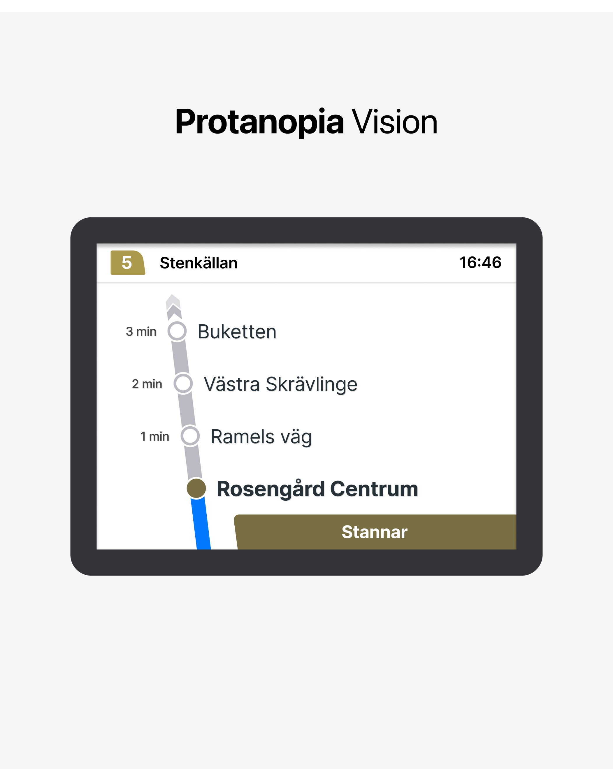
In the color blindness analysis, we can clearly see that the newly selected colors are more distinguishable compared to the previous design.
3.2. Other minor additions
What else can be improved?
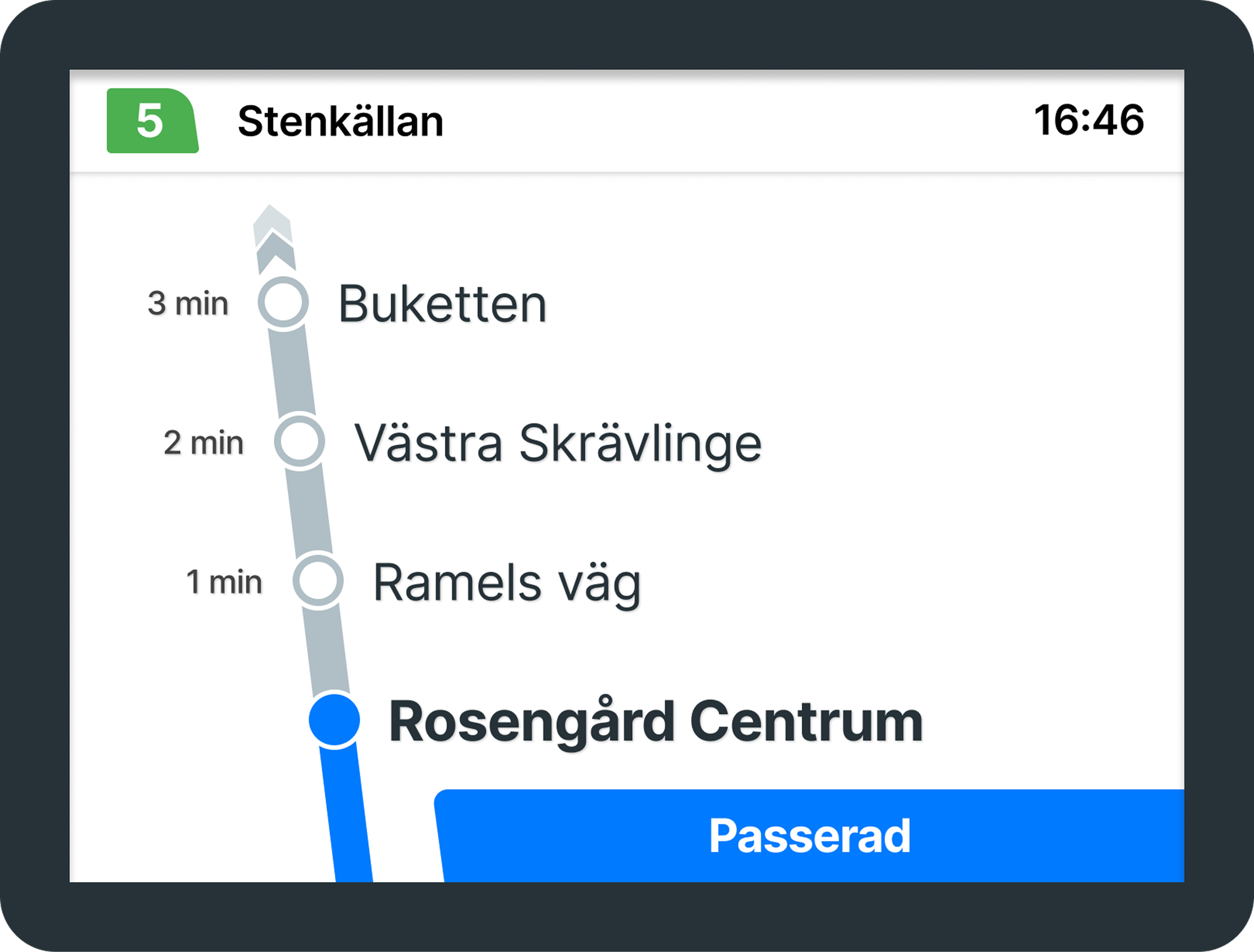
Sometimes there is a slight delay when displaying the stops that have been passed. Even after a stop is passed, the “Stannar” warning and the red circle sometimes continue to appear. This can cause confusion for users who do not constantly monitor the screen. This can be further improved by providing synchronization and adding more interactivity and motion to the screen.
Additionally, adding the label ‘Passerad’ (Passed) for stops that have already been visited would provide better clarity and reduce confusion for passengers.
In addition to these features, providing audio support for the screen could make it easier for users to access information.

Announcing information such as upcoming and current stops in both English and Swedish would help passengers stay informed.
This way, the design would be reinforced through multiple sensory channels, improving accessibility for all users.
- Conclusion: Lessons Learned
Today, many people have vision problems, not just color blindness, but other visual impairments as well. That’s why it’s important for all of us to improve the visibility of commonly used screens, like those in public transportation.

Small changes can make a big
difference.
I hope this article encourages more discussions on accessibility in public transportation. If you have any thoughts or suggestions, I’d love to hear them!
UX Case Study
Enhancing Accessibility: A UX/UI Evaluation of Skånetrafiken’s
On-Board Information Screens
February 2025 - Personal Project
Project Context
I took a closer look at how Skånetrafiken’s on-board bus screens in Malmö could be made more accessible.
Project Details
Type
Article
Role
Product Designer
Project Tags
Skånetrafiken, Transportation, Color Blindness
Project Source
You can read this article on Medium
- Introduction: Why This Matters
Like many Malmö residents, I rely on public transportation for daily commuting. Skånetrafiken provides a well-structured app that delivers all the essential travel details — bus routes, schedules, transfers, and walking distances — in a clear and user-friendly way.
Inside the buses, digital screens display real-time stop information, including the current location, upcoming stops, and estimated time of arrival. At first glance, the design seems functional and well-structured. However, as a designer, one question immediately came to my mind:
Are these screens accessible and user-friendly for everyone?
In the bus screen shown in the photo, green is used to represent the route. As the bus approaches a stop, red elements appear: the stop’s empty circle turns red, and a box with the text “Stannar”(Stopping) is displayed.
This means that red and green — two colors that are particularly challenging for colorblind users — are frequently used together.
While the interface works well for me, I began to wonder if it was equally accessible for everyone. This curiosity led me to evaluate the screen design from a UX perspective and explore ways to enhance its accessibility.
Given the high rate of public transport use in Sweden, these statistics highlight the importance of considering color blindness and other visual impairments in design.
By addressing these challenges, we can create a more inclusive experience that ensures vital travel information is clear and accessible to all passengers with small changes.
- Current Design: Key Issues
According to information from Skånetrafiken, Malmö’s bus routes are divided into two categories:
City Bus and Regional Bus. In the on-board bus information screen designs for these routes, the path illustration adopts the color of the respective line. However, this creates some confusion. By conducting a general evaluation, we can identify the key issues.
From color psychology perspective, using green and yellow to represent an ongoing route may be misleading, as green typically signifies success or completion, while yellow suggests caution or a temporary state.
The green-red combination can be difficult to distinguish for users with color blindness, while the yellow-red pairing is problematic due to their similar hue and meaning.
Deuteranopia (Green Blindness), Protanopia (Red Blindness), and Tritanopia (Blue-Yellow Blindness) are the most common types of color blindness. By evaluating these conditions, we can gain insight into how users perceive the screens.
While conducting this evaluation, I used Figma Color Blind plugin. I also tested the accuracy of these findings using color blindness tools such as Colblindor and CVSimulator.
Here are the results:
As clearly seen in the vision of the different types of color blindness, the colors on the screens become very similar to each other, resulting in a decrease in clarity.
- Improvements: A More Accessible Aproach
How can we make the screens better?
Resolving this color confusion is actually quite simple. With minor adjustments, we can make the screen more
user-friendly and accessible. It’s important that the changes are minimal because this screen is used by many people. Designing a screen that is too different from the original might confuse the current users and take time for them to adapt. Therefore, my primary goal is to improve the experience with small adjustments.
3.1. Choosing the right colors
Blue and gray are generally considered safe colors for different types of color blindness. While they are not universally accessible in all cases, they can be quite effective when paired with the right design elements to provide a clear distinction.
That’s why I chose gray to represent the route and blue to indicate the progress. By visually distinguishing between completed and upcoming routes, users can more easily interpret the information displayed on the screen. These colors can be used for both the City Bus and Regional Bus routes.
We can also conduct a color blindness analysis on these newly selected colors and observe the results.
In the color blindness analysis, we can clearly see that the newly selected colors are more distinguishable compared to the previous design.
3.2. Other minor additions
What else can be improved?
Sometimes there is a slight delay when displaying the stops that have been passed. Even after a stop is passed, the “Stannar” warning and the red circle sometimes continue to appear. This can cause confusion for users who do not constantly monitor the screen. This can be further improved by providing synchronization and adding more interactivity and motion to the screen.
Additionally, adding the label ‘Passerad’ (Passed) for stops that have already been visited would provide better clarity and reduce confusion for passengers.
In addition to these features, providing audio support for the screen could make it easier for users to access information.
Announcing information such as upcoming and current stops in both English and Swedish would help passengers stay informed.
This way, the design would be reinforced through multiple sensory channels, improving accessibility for all users.
- Conclusion: Lessons Learned
Today, many people have vision problems, not just color blindness, but other visual impairments as well. That’s why it’s important for all of us to improve the visibility of commonly used screens, like those in public transportation.
Small changes can make a big difference.
I hope this article encourages more discussions on accessibility in public transportation. If you have any thoughts or suggestions, I’d love to hear them!


UX Case Study
Enhancing Accessibility: A UX/UI Evaluation of Skånetrafiken’s
On-Board Information Screens
February 2025 - Personal Project
Project Details
Type
Article
Role
Product Designer
Project Tags
Skånetrafiken, Transportation, Color Blindness
Project Source
You can read this article on Medium
Project Context
I took a closer look at how Skånetrafiken’s on-board bus screens in Malmö could be made more accessible.
- Introduction: Why This Matters
Like many Malmö residents, I rely on public transportation for daily commuting. Skånetrafiken provides a well-structured app that delivers all the essential travel details — bus routes, schedules, transfers, and walking distances — in a clear and user-friendly way.
Inside the buses, digital screens display real-time stop information, including the current location, upcoming stops, and estimated time of arrival. At first glance, the design seems functional and well-structured. However, as a designer, one question immediately came to my mind:
Are these screens accessible and user-friendly for everyone?
In the bus screen shown in the photo, green is used to represent the route. As the bus approaches a stop, red elements appear: the stop’s empty circle turns red, and a box with the text “Stannar”(Stopping) is displayed.
This means that red and green — two colors that are particularly challenging for colorblind users — are frequently used together.
While the interface works well for me, I began to wonder if it was equally accessible for everyone. This curiosity led me to evaluate the screen design from a UX perspective and explore ways to enhance its accessibility.
Given the high rate of public transport use in Sweden, these statistics highlight the importance of considering color blindness and other visual impairments in design.
By addressing these challenges, we can create a more inclusive experience that ensures vital travel information is clear and accessible to all passengers with small changes.
- Current Design: Key Issues
According to information from Skånetrafiken, Malmö’s bus routes are divided into two categories:
City Bus and Regional Bus. In the on-board bus information screen designs for these routes, the path illustration adopts the color of the respective line. However, this creates some confusion. By conducting a general evaluation, we can identify the key issues.
From color psychology perspective, using green and yellow to represent an ongoing route may be misleading, as green typically signifies success or completion, while yellow suggests caution or a temporary state.
The green-red combination can be difficult to distinguish for users with color blindness, while the yellow-red pairing is problematic due to their similar hue and meaning.
Deuteranopia (Green Blindness), Protanopia (Red Blindness), and Tritanopia (Blue-Yellow Blindness) are the most common types of color blindness. By evaluating these conditions, we can gain insight into how users perceive the screens.
While conducting this evaluation, I used Figma Color Blind plugin. I also tested the accuracy of these findings using color blindness tools such as Colblindor and CVSimulator.
Here are the results:
As clearly seen in the vision of the different types of color blindness, the colors on the screens become very similar to each other, resulting in a decrease in clarity.
- Improvements: A More Accessible Aproach
How can we make the screens better?
Resolving this color confusion is actually quite simple. With minor adjustments, we can make the screen more
user-friendly and accessible. It’s important that the changes are minimal because this screen is used by many people. Designing a screen that is too different from the original might confuse the current users and take time for them to adapt. Therefore, my primary goal is to improve the experience with small adjustments.
3.1. Choosing the right colors
Blue and gray are generally considered safe colors for different types of color blindness. While they are not universally accessible in all cases, they can be quite effective when paired with the right design elements to provide a clear distinction.
That’s why I chose gray to represent the route and blue to indicate the progress. By visually distinguishing between completed and upcoming routes, users can more easily interpret the information displayed on the screen. These colors can be used for both the City Bus and Regional Bus routes.
We can also conduct a color blindness analysis on these newly selected colors and observe the results.
In the color blindness analysis, we can clearly see that the newly selected colors are more distinguishable compared to the previous design.
3.2. Other minor additions
What else can be improved?
Sometimes there is a slight delay when displaying the stops that have been passed. Even after a stop is passed, the “Stannar” warning and the red circle sometimes continue to appear. This can cause confusion for users who do not constantly monitor the screen. This can be further improved by providing synchronization and adding more interactivity and motion to the screen.
Additionally, adding the label ‘Passerad’ (Passed) for stops that have already been visited would provide better clarity and reduce confusion for passengers.
In addition to these features, providing audio support for the screen could make it easier for users to access information.
Announcing information such as upcoming and current stops in both English and Swedish would help passengers stay informed.
This way, the design would be reinforced through multiple sensory channels, improving accessibility for all users.
- Conclusion: Lessons Learned
Today, many people have vision problems, not just color blindness, but other visual impairments as well. That’s why it’s important for all of us to improve the visibility of commonly used screens, like those in public transportation.
Small changes can make a big difference.
I hope this article encourages more discussions on accessibility in public transportation. If you have any thoughts or suggestions, I’d love to hear them!
Suheda Kocal
Based in Malmö, Sweden
Let’s Talk
akhancersuheda@gmail.com


